Silhouette First, Stats Later: The Design Pipeline That Decides Your Next Obsession
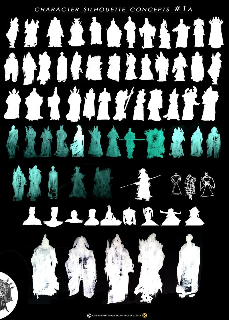
Photo: character design silhouette sketches game art process, via i.pinimg.com
Here's a thought experiment every gacha player has accidentally run. Picture your favorite unit. Got them? Now picture the fourth-best DPS on your account. Chances are, one of those mental images is crisp and the other is basically a smudge.
That gap? It's not an accident. It's the entire business model.
The Silhouette Test Is Real, and It's Ruthless
Character designers at major studios — and this practice runs deep in Japanese mobile game development — routinely run new units through what insiders call the silhouette check. Strip away all color and detail. Show the outline to a test audience. If players can't tell the character apart from the rest of the roster in under a second, the design goes back to the drawing board.
Think about why that matters in a gacha context. Your roster might hold 80 characters. The ones that make money are the ones you can spot instantly in a crowded battle screen, a YouTube thumbnail, or — crucially — a banner splash art on the summon screen. Distinctiveness isn't an aesthetic choice. It's a sales funnel.
This is why certain design shorthand keeps working: the oversized weapon, the asymmetric hair, the one floating accessory that breaks the body's outline. Every element exists to survive being squished into a 64-pixel party portrait.
Color Theory Wears the Wallet
Once the silhouette passes, color does the heavy lifting. Gacha designers lean hard on limited, high-contrast palettes — usually two or three dominant hues per character — because the brain files characters away by color first and details later.
There's a reason so many banner icons feature a character against a saturated, single-color backdrop. It's not just pretty; it builds a color association you'll carry into every future appearance. When that character shows up in an event, a merch drop, or a collab trailer, your brain goes oh, it's them before you've consciously processed anything.
US players talk about "waifu over meta" like it's a joke, but it's actually a confession: emotional attachment routinely beats spreadsheet value. And attachment starts with recognition. You cannot love a character you can't instantly identify.
The Illustrator Economy
Here's a layer most newer players never see: the freelance illustrator pipeline. Plenty of top-tier gacha characters are designed by outside artists — names you'd know from Pixiv, Twitter/X, or illustration books — who bring their own fanbases with them.
When a game announces a unit by a beloved illustrator, half the pulling decision is already made. Fans of the artist's style will roll for the character the same way comic readers buy a book for the cover artist. Japanese publishers understand this completely, which is why artist credits get promoted in the pre-release hype cycle, right alongside the voice actor reveal.
We talked to a few fan artists at US anime conventions this year, and the consensus was blunt. One Midwest-based illustrator who does commission work told us: "I can tell within ten seconds of a character reveal whether the design was built for gameplay or built for a wallpaper. The wallpaper ones always sell. Players say they want balance patches. They pull for the poster."
That's the wallpaper test in the wild — the unofficial version of the silhouette check. If the community is turning your splash art into phone backgrounds before the kit numbers even drop, you've won.
Why Equal-Strength Characters Fade
Every player has a unit like this: statistically excellent, meta-relevant for months, and yet completely forgettable. Usually the failure happened at the top of the pipeline. Maybe the silhouette blended into the roster. Maybe the palette collided with three existing characters. Maybe the illustrator's style didn't mesh with the game's art direction, leaving a design that reads as generic.
Tier-list culture makes this worse — or more visible. When community tier lists rank characters, they're ranking kits, but the presentation of those lists on YouTube and Reddit is visual. A boring design gets a boring thumbnail slot, gets fewer clicks, gets less community conversation, gets less attachment. The stats were fine. The distribution wasn't.
What This Means for Your Pulls
None of this is a scandal — it's craft. Character design in gacha games is some of the most disciplined commercial art on the planet, refined over a decade of Japanese mobile development. But knowing the machinery changes how you spend.
Next time you feel the urge to pull, run your own audit: is this excitement about the kit, or about the wallpaper? Both answers are valid. Only one of them should be checked against your budget.
Roll deep. But know what's rolling you back.